Booklyng's Multichoice Offer
Booklyng optimises clients' visits to the webs of the hotels converting them into effective reservations thanks to a personalized experience.
We were asked to redesign a pop-up offer for one of the biggest hotel chains in Spain.
From our office in Barcelona I was managing a team of 3 designers and two developers remotely working from Madrid and Rome.
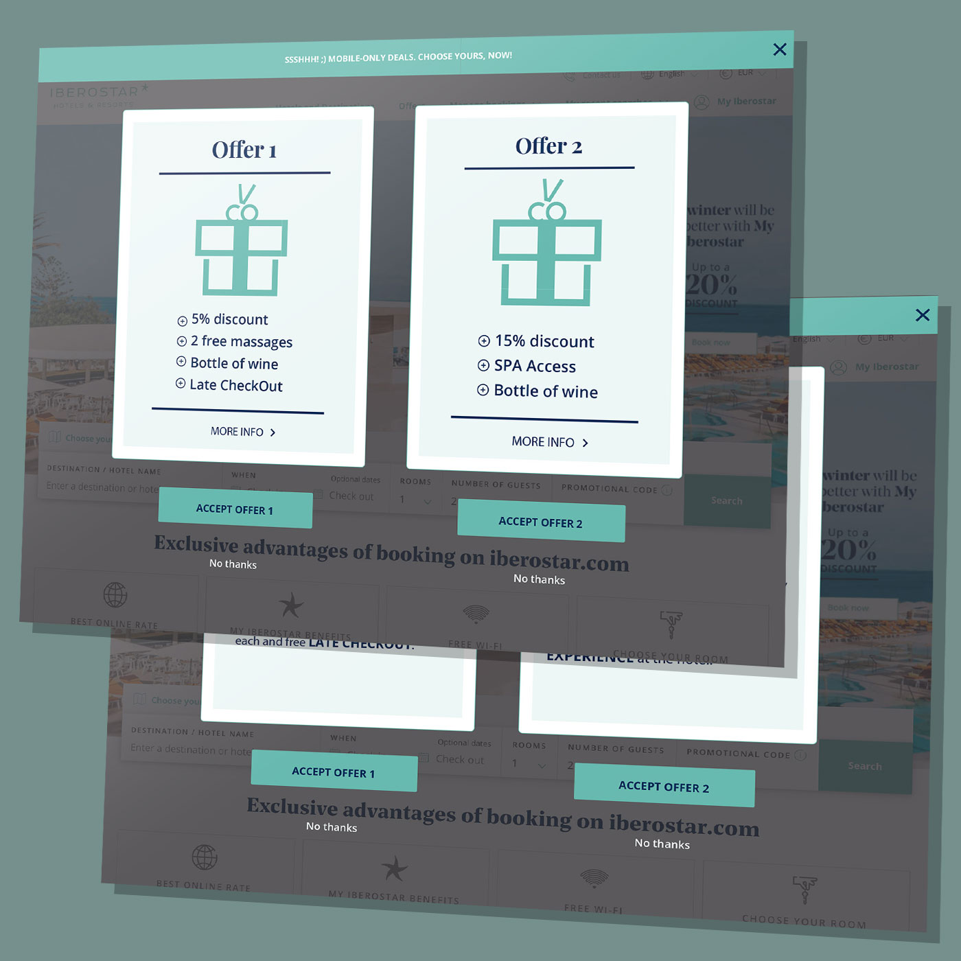
The user was given two different choices of offers (2 cards) at the moment of making a direct booking in the hotel website.
Each card could be flipped: the front of each card was showing the claim and attracting the customer, the back was describing in detail the offer.
The Problem
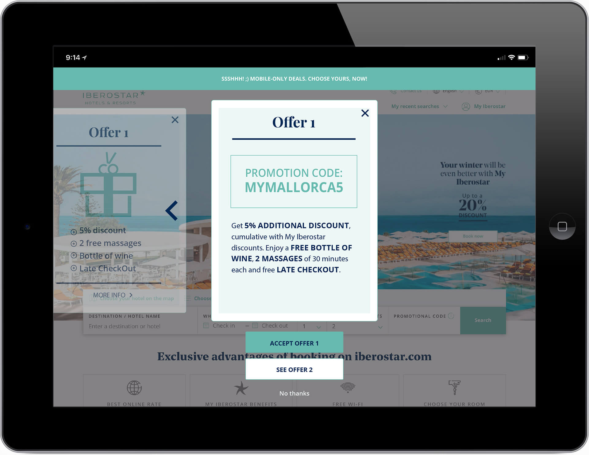
The actual design has been made for desktop (NOT mobile first) and desperately needed to be made responsive so it could work well on smartphones and tablets.
It wasn't attracting too many customers, the problem was that the whole process seemed a little bit confusing on desktop from the start.
Booklyng's major asset is their exclusive tool board (called: “The Wizard”) that gives you the ability to create an offer pop-up with just a few clicks. That meant that this layout and its development had to be a “product”, ready to be reused by/for different clients as a ready-made template, so the HTML and CSS structure had to be solid and working everywhere.
Strategy/metodology
As we needed to use Brooklyn's proprietary tool board (see above) everything was developed mostly online, and the results were directly shown in our browsers as soon as we hit “publish”.
This is one of the reasons why I was working with Lean UX methodology:
Based on Lean-Agile methodologies this is a process that identifies a problem that should lead to some assumptions that create hypothesis, so you can quickly develop real solutions and/or amend them, ditch them or add new ones. An idea based work in progress process, more on this here.
Analysis and Design
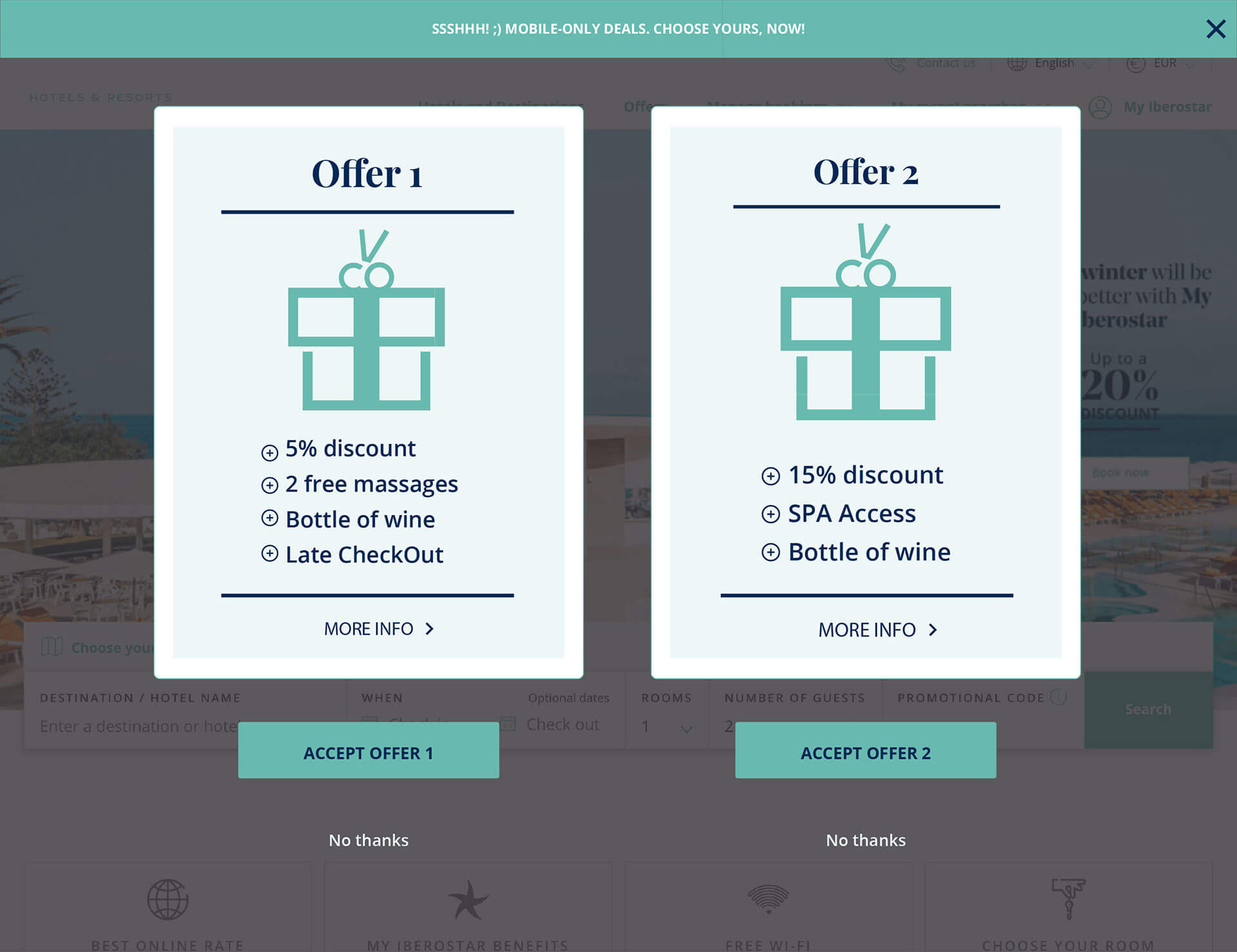
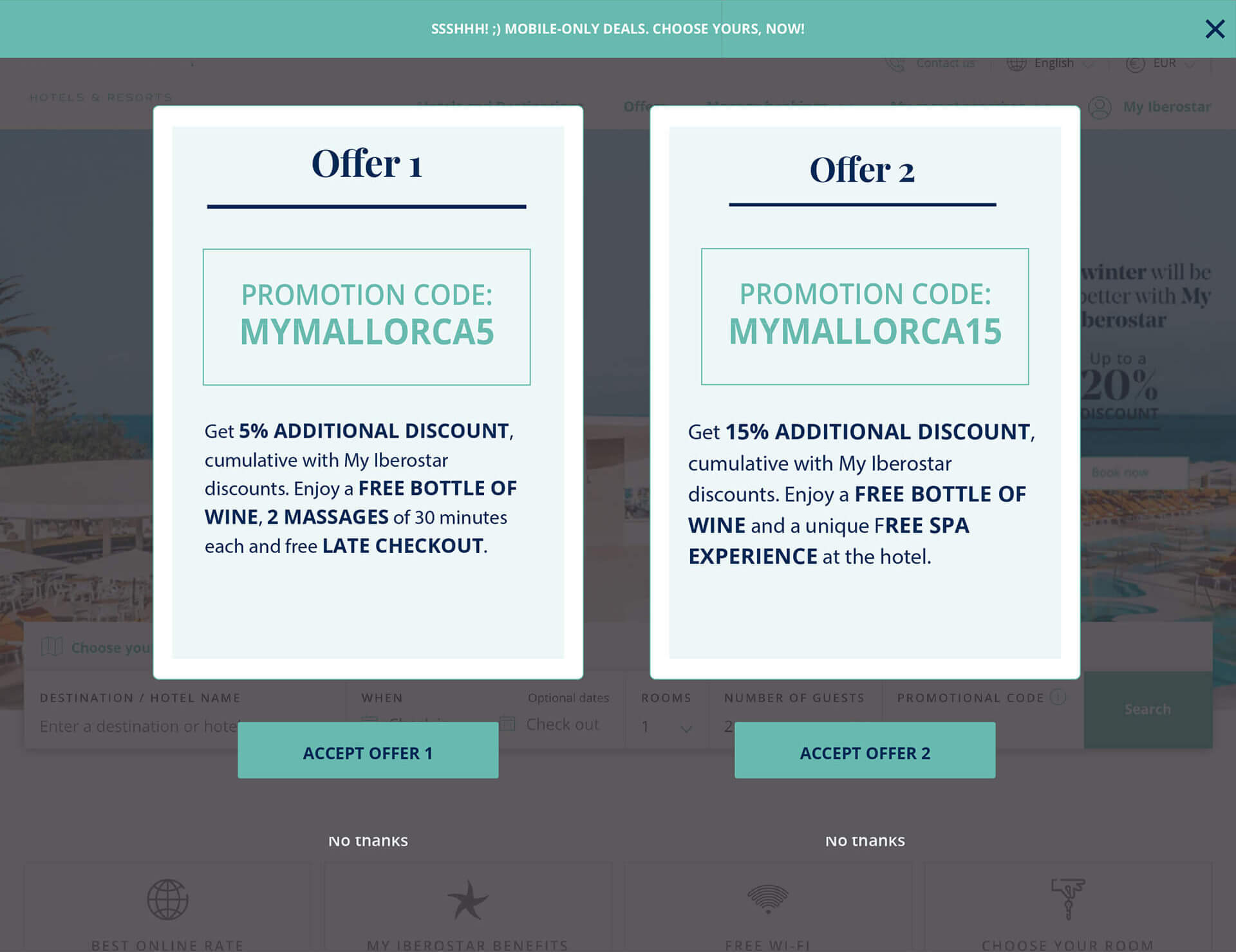
The actual design was consisting of two cards and four states (desktop), where the user could:
- Offer 1 Front
Click on the offer to flip the card and see the back of it: More info button. - Offer 1 Back
Click and return to the front. - Offer 2 Front
Click on the offer to flip the card and see the back of it: More info button. - Offer 2 Back
Click and return to the front.
In each of the four states the user could accept one of the offers as the main CTA was alway present.
We made 22 internal interviews with some of our customers (hoteliers and hotel staff, not real users) and asked them for some feedback about:
- Navigation
- User interactions and workflow
- Design element interactions
- Product page behavior
- Whole process time
- Scroll depth
- Checkout process
The task was quite simple: get to the end of the customer journey and receive an email with their offer/discount confirmation.
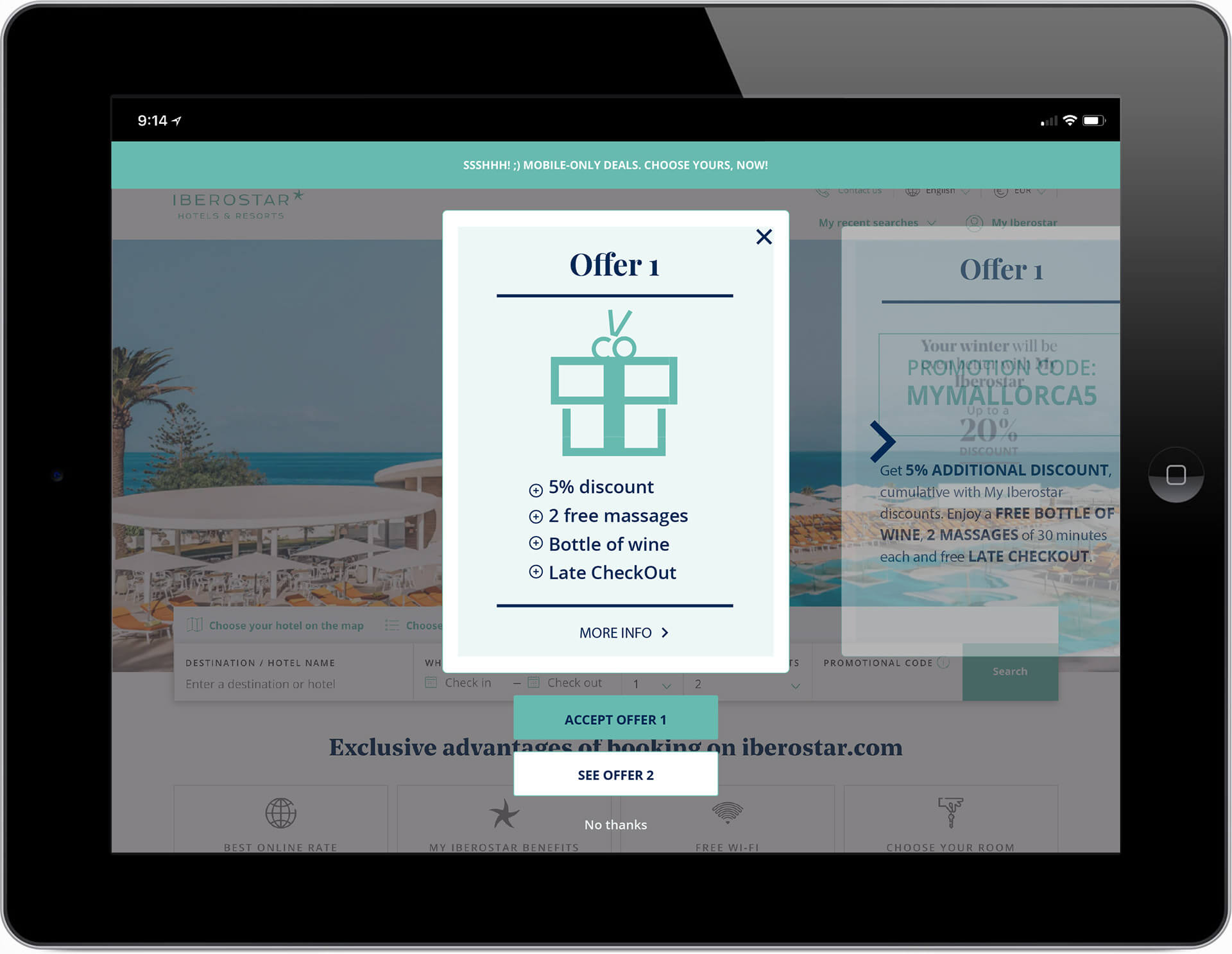
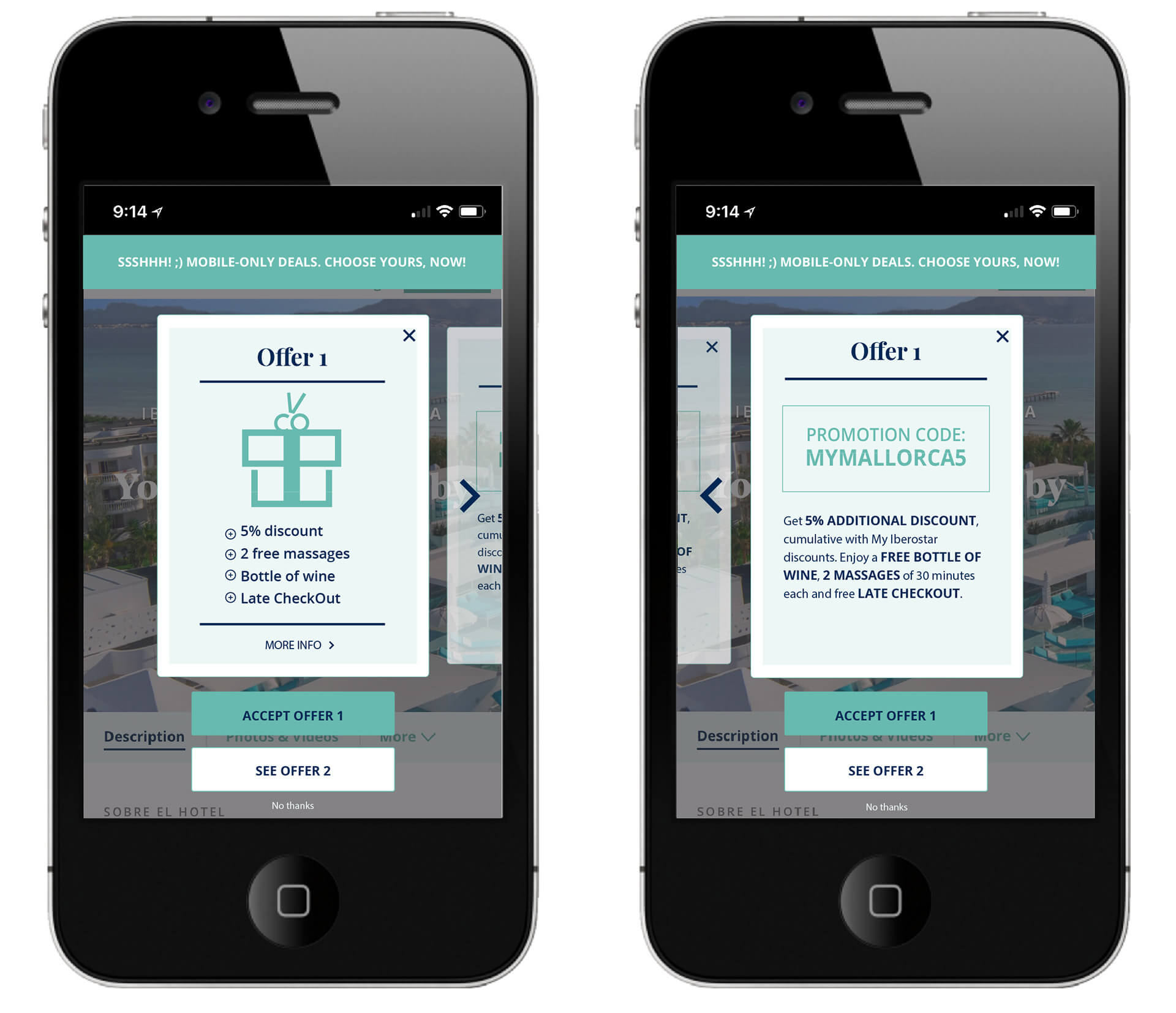
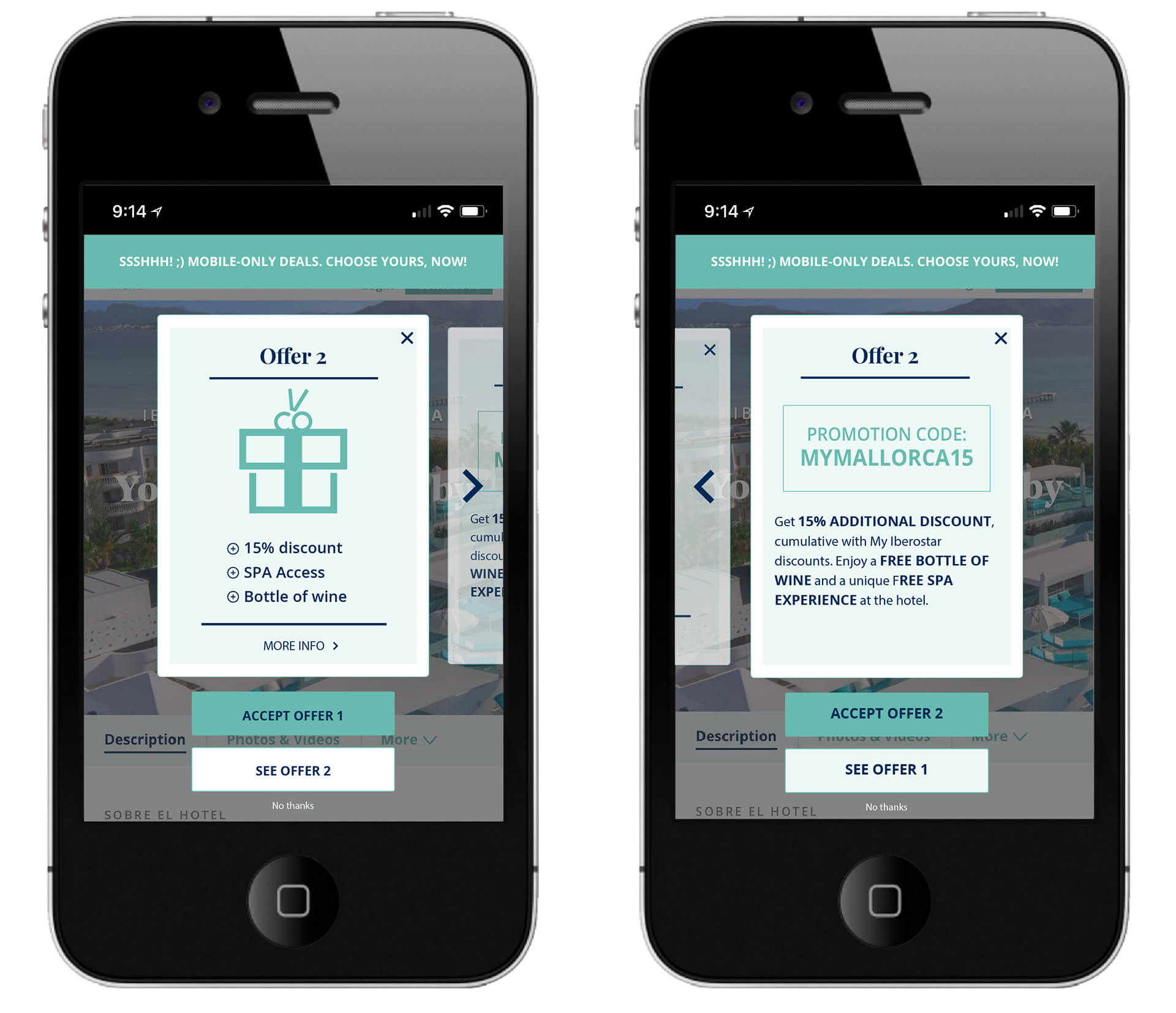
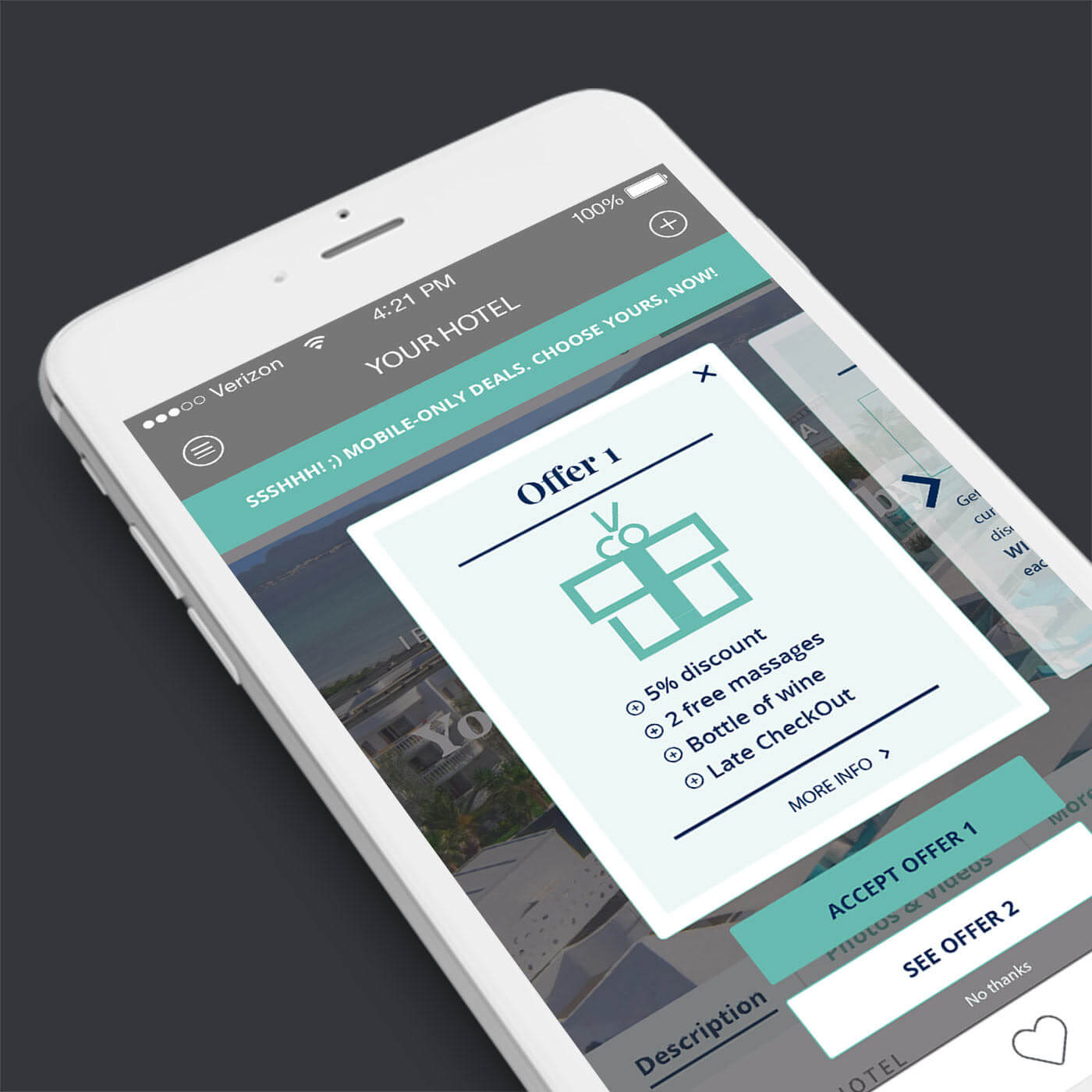
The first thing that came out is was that we needed to show only 1 card at time on smaller screens.
We added a second button below the main CTA that would point the user to Offer 2, we also made the back of the active card visible on the right.
So the user, instead of “click and flip” (desktop version) could do a left swipe on the mobile to see the back of the card and read more about it before accepting the offer. Hitting the See Offer # button at the bottom of each card shows the alternative offer, while the More Info button shows the back of the card the same way as the left swap does.
New 4 states proposals, where the user could:
- Offer 1 Front
Swipe the card to the LEFT and/or click on the card to see the back of it
(More info >). - Offer 1 Back
Swipe the card to the RIGHT and/or click on the card to return to the front. - Offer 2 Front
Swipe the card to the LEFT and/or click on the card to see the back of it
(More info >). - Offer 2 Back
Swipe the card to the RIGHT and/or click on the card to return to the front.
Each state was showing a main CTA: Accept Offer # and a secondary CTA: See Offer #.
After the first layout was chosen and validated we proceeded to the development.
Implementation
Thanks to Booklyng's exclusive script that just need to be run from a browser, all the people working at Booklyng in Barcelona, Madrid, Rome and the marketing and technical teams of the hotel chain could view and edit the offer in real time on the chain website without it being visible to real customers (yet).
That means that each product could be viewed and tested (as it was) by anyone with that script. This kind of test was concentrating more on the actual User Experience, the user journey was repeatedly analysed and tested, amendments to the design and the development were made.
We also used Browserstack to test more technical details and be sure that the layout was working fine on most devices.
Results
After three months on the hotel website it managed to achieve:
+32%
Conversion Rate
+145%
Guest information
+33%
Total Website Revenue
The final product ended up as one of the most successful at Booking.
Tools used
Adobe Illustrator
Adobe XD
HTML5
CSS3
Bootstrap 4.0
Javascript