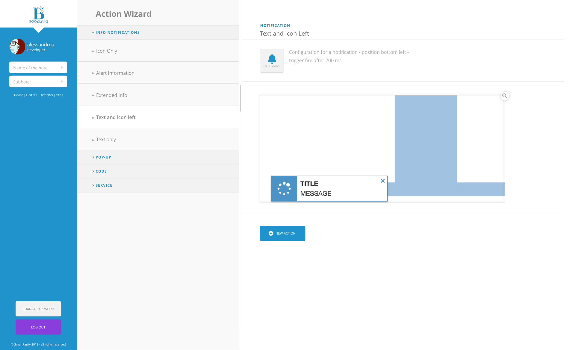
Booklyng's "Wizard" Manager
Booklyng optimises clients' visits to the webs of the hotels converting them into effective reservations thanks to a personalized experience.
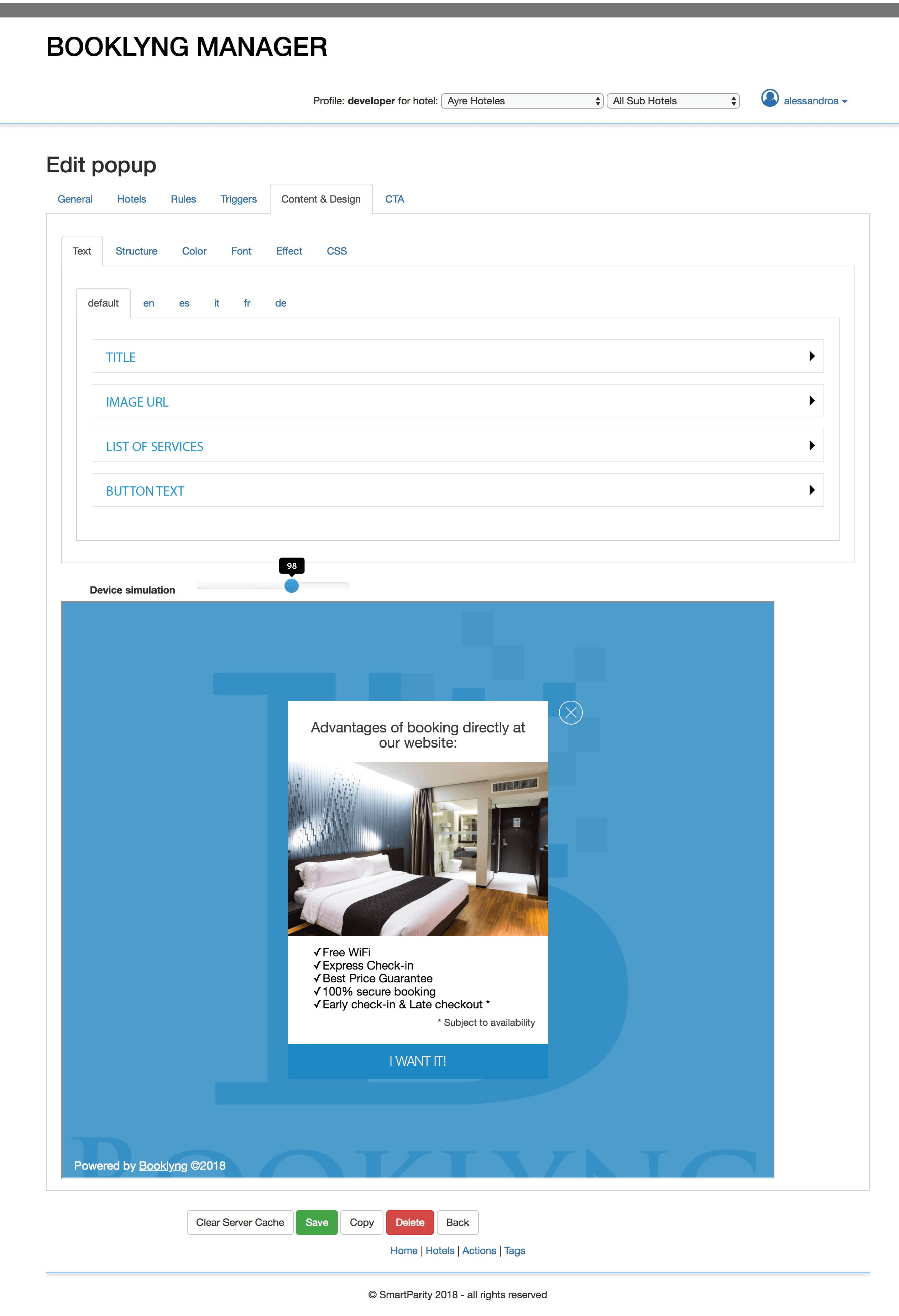
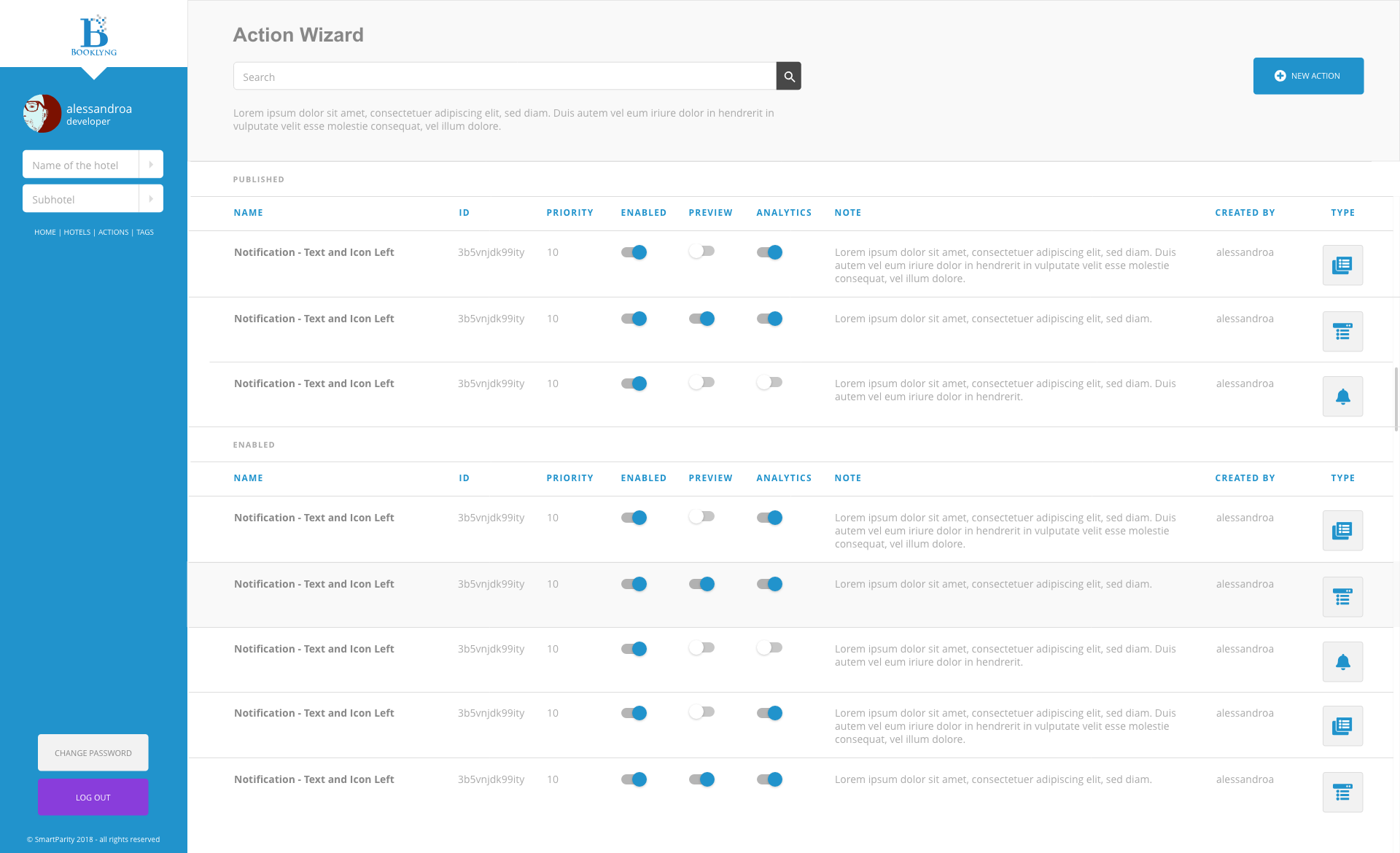
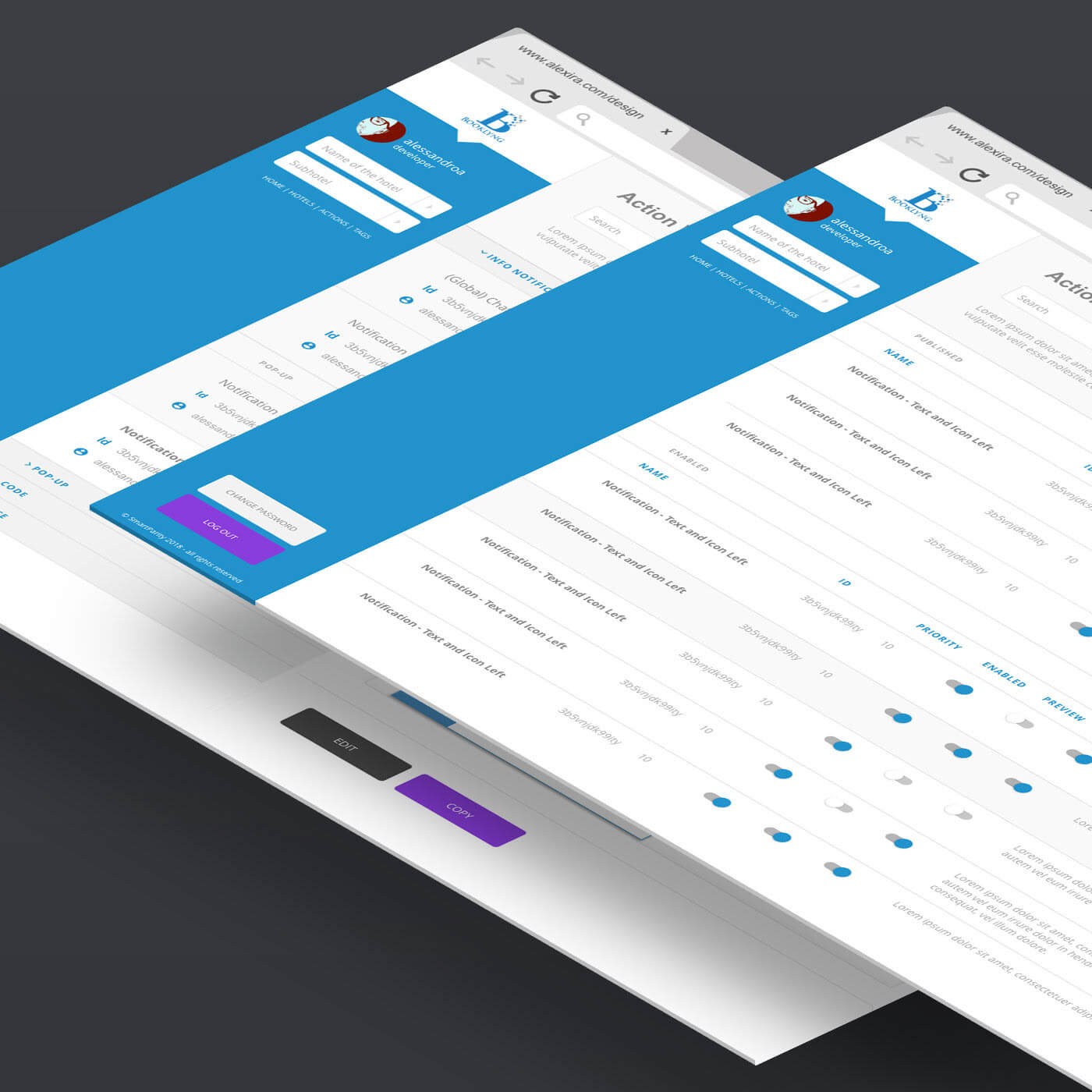
Booklyng's major asset is their exclusive tool board, called: “Wizard”, that gives you the ability to create a campaign, an offer and customer journeys with just a few clicks. This if the user just wants to pick up one of the readymade templates, change the main image, colors, font and the message and so on...
But the real possibilities are huge:
An expert user could use his/her own html, css and scripts, also he/she could create a special dedicated theme that would be associated with his/her hotel/chain, create detailed campaigns targeted to their customers, duplicate each product and reuse it whenever they needed.
From our office in Barcelona I was managing a team of 3 designers and being in contact every day with two developers, all of them remotely working from Madrid and Rome.
The Problem
This Wizard hasn't been “designed” at all, but it grew up day by day, month by month in the hands of the developers.
Even if the developers had done a quite good job considering all the limitations it was obvious that we needed to find time to work on it, and find new solutions from a user experience point of view.
Booklyng's major asset is their exclusive tool board, called: “Wizard”, that gives you the ability to create a campaign, an offer and customer journeys with just a few clicks.
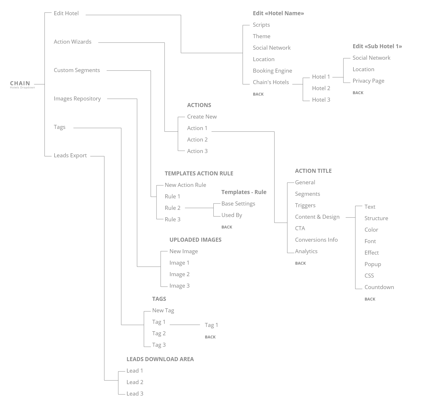
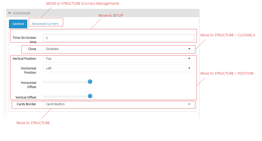
Everything was layed down and structured in nested tabs. And that was making the interface quite difficult to navigate, also the more important tools and elements were hidden. On top of that the preview was below everything. In a normal editing situation the user was scrolling down all the time to see the results.
Strategy/metodology
We were trying to follow what I consider the essential path for any correct design process: User research, mockups, wireframing, prototyping, testing, final design, implementation.
The team was using Lean UX methodology.
Based on Lean-Agile methodologies this is a process that identifies a problem that should lead to some assumptions that create hypothesis, so you can quickly develop real solutions and/or amend them, ditch them or add new ones. An idea based work in progress process, more on this here.
Research and analysis
We made 35 interviews with some of our customers and asked them to highlight their pain points.
We tested for:
- Navigation
- User interactions and workflow
- Design element interactions
- Product page behavior
- Whole process time (create a product)
What became clear was that overall the Wizard was quite difficult to use for someone that didn't have design and/or coding knowledge.
For a hotelier that only wanted to create an offer for his/her hotel the Wizard was just too much, they didn't have neither the time nor the capabilities or the desire to dive into all the Wizard's possibilities.
Solution
Concentrate on ready made, reusable products.
We started to create different themed sets of offers, consisting in a sub product for each step in the customer journey. We also created custom user journeys based both on our past experience and on specific suggestions, ready to be used by our clients.
Create two different intervention layers in the Wizard: simple/advanced.
We decided to temporarily hide the advanced functionalities for default and to present only the basic ones to the normal users. This way you could really create a basic, still effective product/offer in nearly no time in the “simple” mode but still had the chance to develop a more complex product if switching to the “advanced” mode.Reorganise the main Hotel Configuration.
Make the Theme section easier to use.
Design & Implementation
We went back to interviewing our users, new feedback was collected and smaller changes were made.
We also used Browserstack to test more technical details and being sure that the Wizard's layout was working fine on most devices.
Results
After just one months of our new release the Wizard Manager lifted its usability by 62%.
+62% SUS
(System Usability Scale)Its now characteristic double layers nature became an essential element to present to new customers and attract them.
Tools used
Adobe Illustrator
Adobe XD
HTML5
CSS3
Bootstrap 4.0
Javascript