Redesigning a desktop app
JUMP Math Lesson Planner
Introduction
JUMP Math is a Canadian non-profit dedicated to helping every child achieve their full potential through mathematics.
As a core part of their ecosystem, the Lesson Planner is a desktop application used by teachers to structure their academic year.
While the original platform was functional, it suffered from rigid logic, poor visual hierarchy, and a lack of device flexibility.
The goal was to transform a static administrative tool into a dynamic, flexible planning environment that adapts to the unpredictable nature of teaching.

Phase 1: Discovery & Research
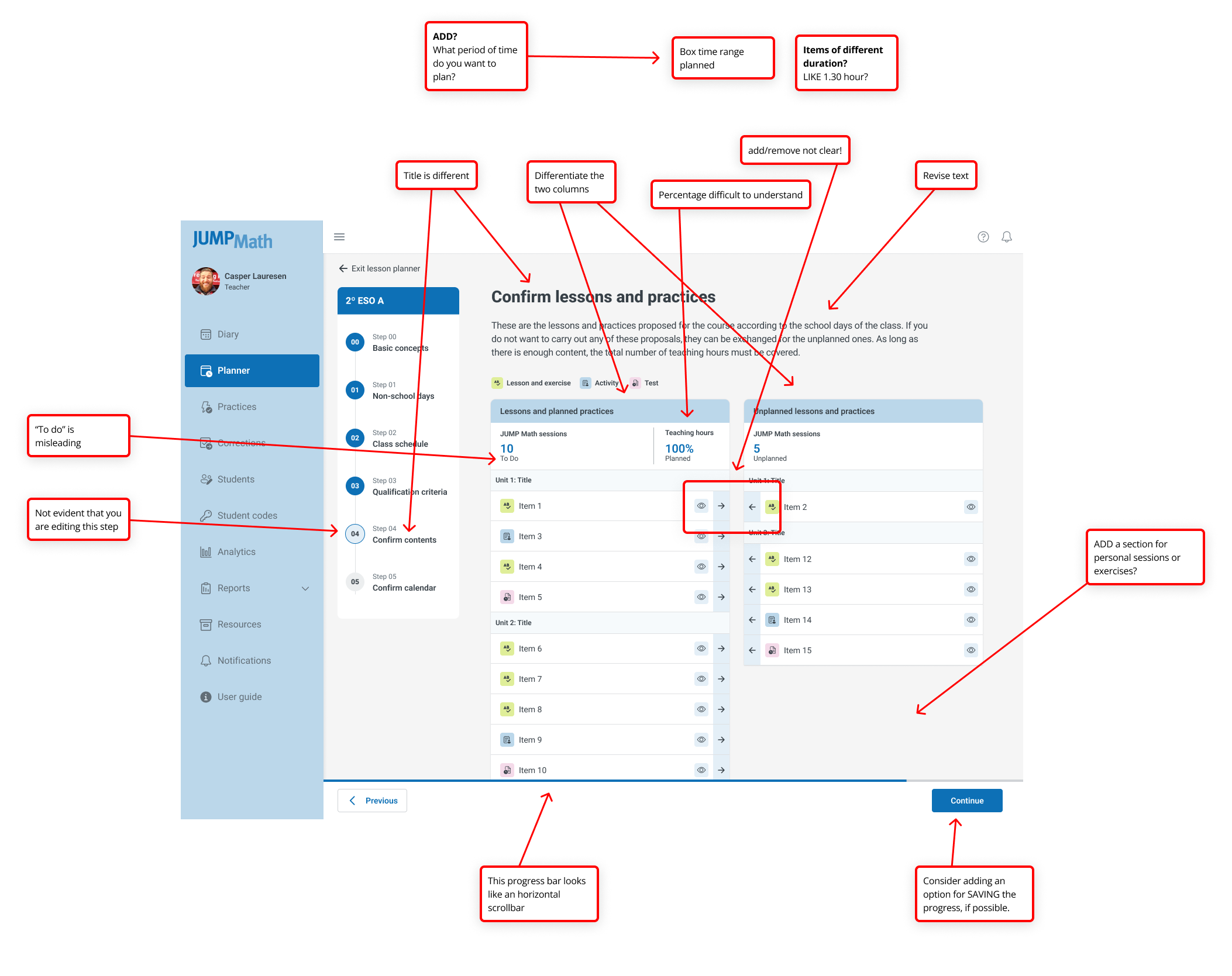
To identify friction points, I conducted internal stakeholder interviews and external usability tests with teachers across Canada, Spain, and Chile.
Key Pain Points Identified:
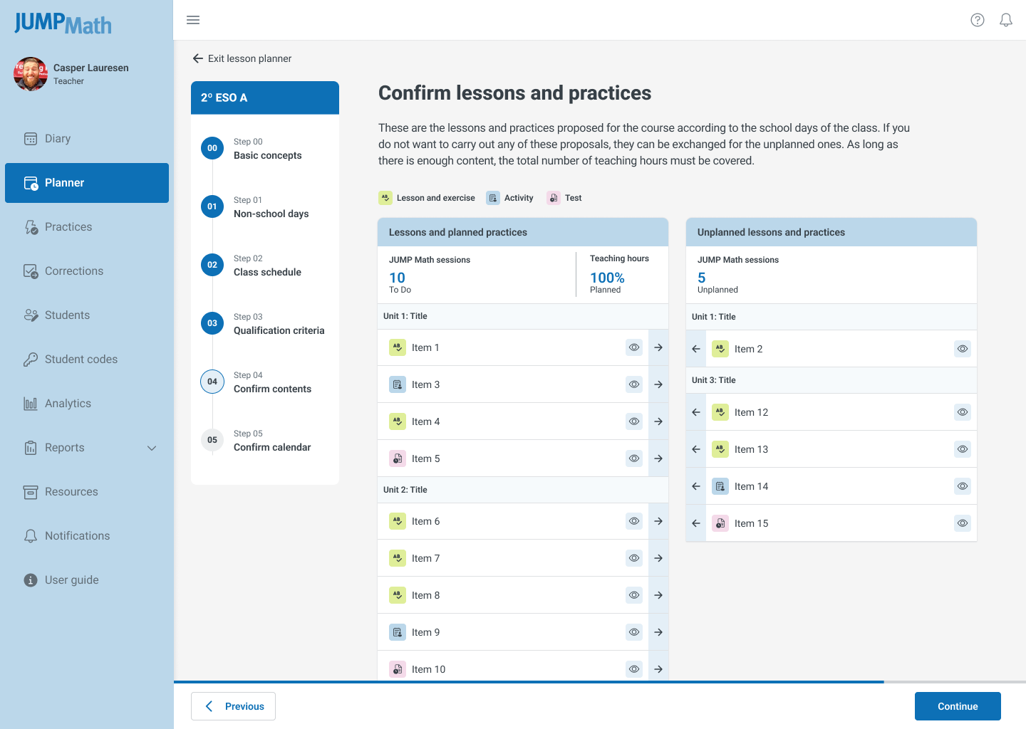
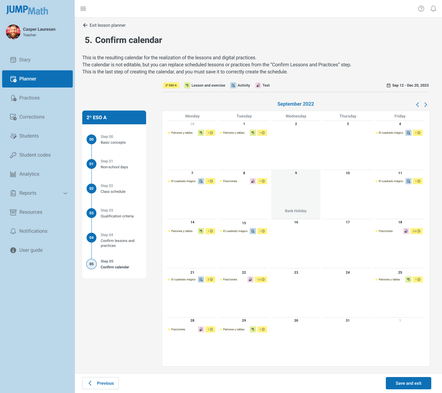
- Rigid Workflow: Planning required a mandatory, linear six-step process that couldn't be bypassed.
- Inflexible Scope: Users could only plan for the entire academic year at once, preventing short-term adjustments.
- Poor Rescheduling: Moving lessons was a manual, error-prone copy-paste process.
- Lack of Visibility: No visual indicators existed for overdue or missed sessions.
- Accessibility Gaps: Typography and color contrast failed WCAG standards, making content unreadable when projected in classrooms.
- Device Limitations: The interface broke on smaller monitors and lacked mobile responsiveness.
Strategy: Findings were prioritized using the MoSCoW method (Must have, Should have, Could have, Won't have) to align development sprints with immediate user needs.
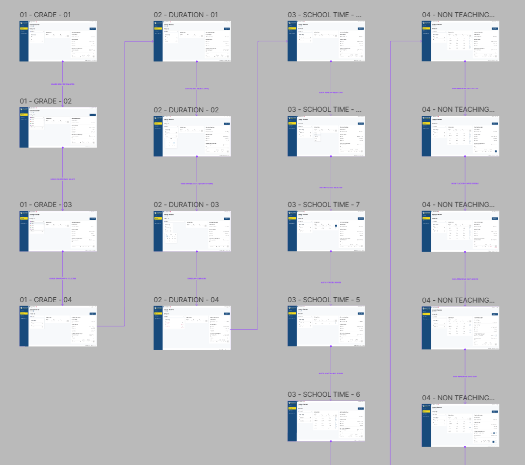
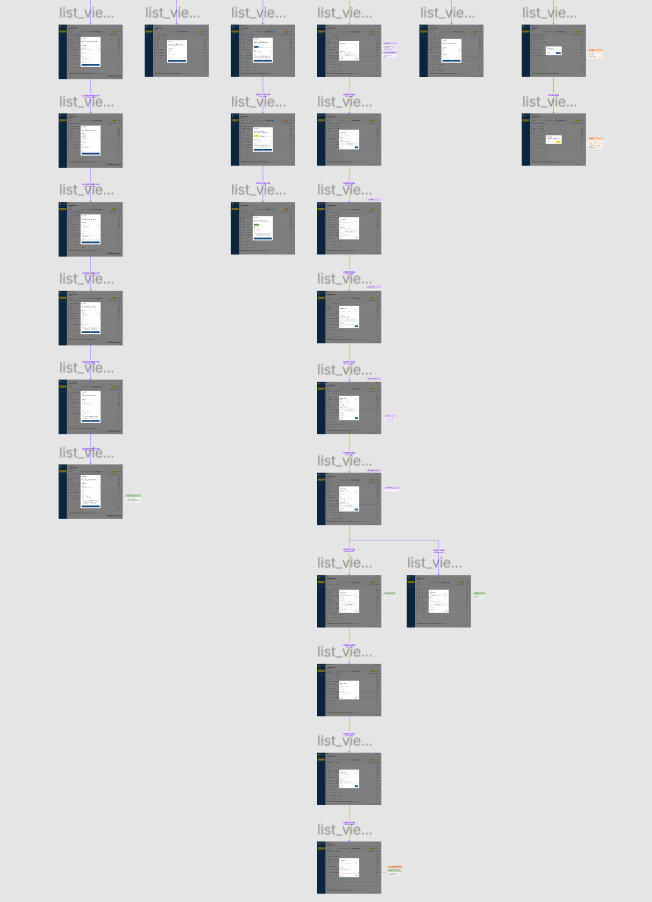
Phase 2: Prototyping & Information Architecture
My primary objective was to dismantle the linear workflow and replace it with a modular, user-controlled architecture.
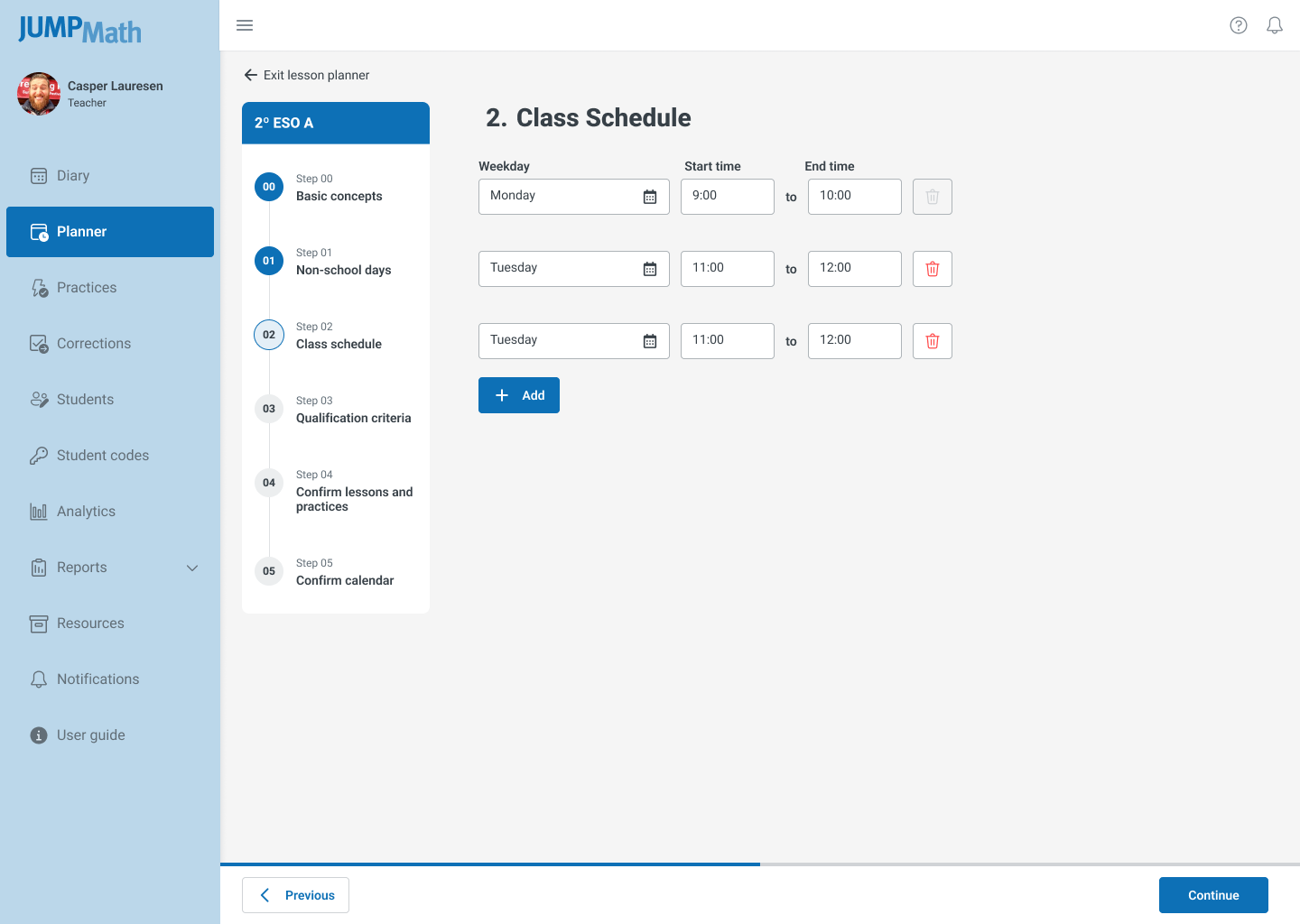
1. Information Architecture (IA)
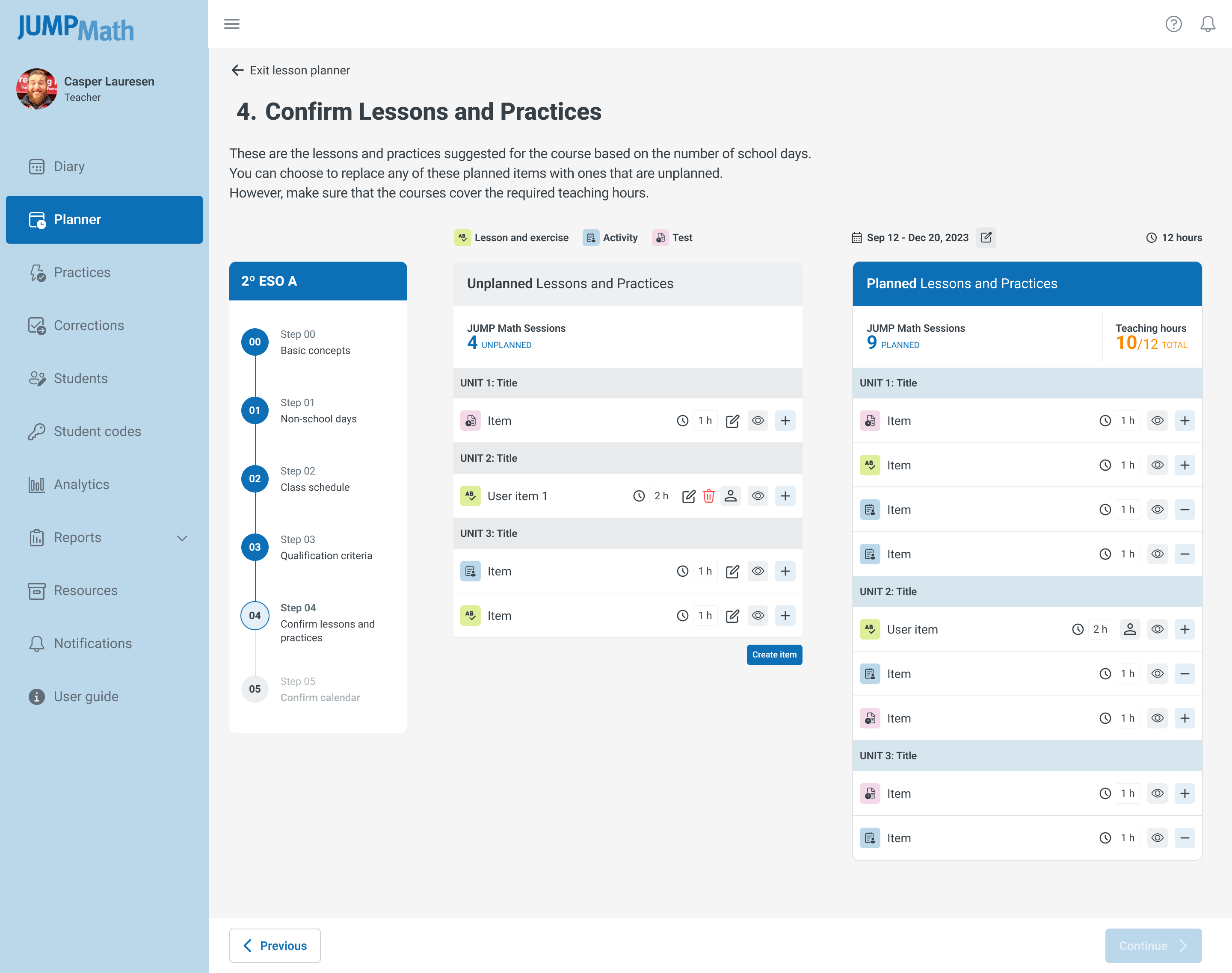
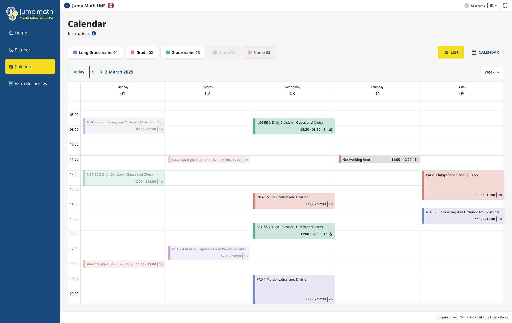
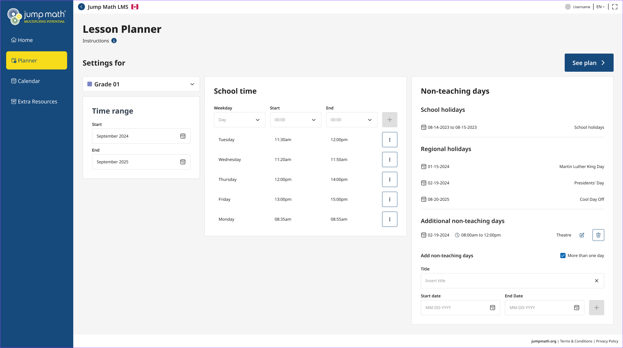
I restructured the app to decouple the "planning scope" from the "view." This allowed users to define their planning window (week, month, trimester, or year) independently of the data structure.
2. Wireflowing:
I mapped new user flows that eliminated redundant confirmation steps. The new flow prioritized drag-and-drop interactions for rescheduling, reducing the cognitive load required to adjust timetables.
Decision: We removed the "Step 4: Confirmation" entirely, relying on auto-save and undo functionality to build trust and speed.
Phase 3: Design & System Implementation
I collaborated closely with engineering to ensure the design was technically feasible and performant.
Iterative Design: I produced low-fidelity wireframes for rapid validation, followed by high-fidelity prototypes. Three distinct visual proposals were tested; the final selection balanced clarity with the brand's educational tone.
Design System Expansion: I updated the existing JUMP Math Design System to include:
- New interactive components for drag-and-drop lists.
- A responsive grid system supporting viewports from 1024px to mobile.
- Updated color tokens to meet WCAG 2.1 AA contrast ratios for classroom projection.
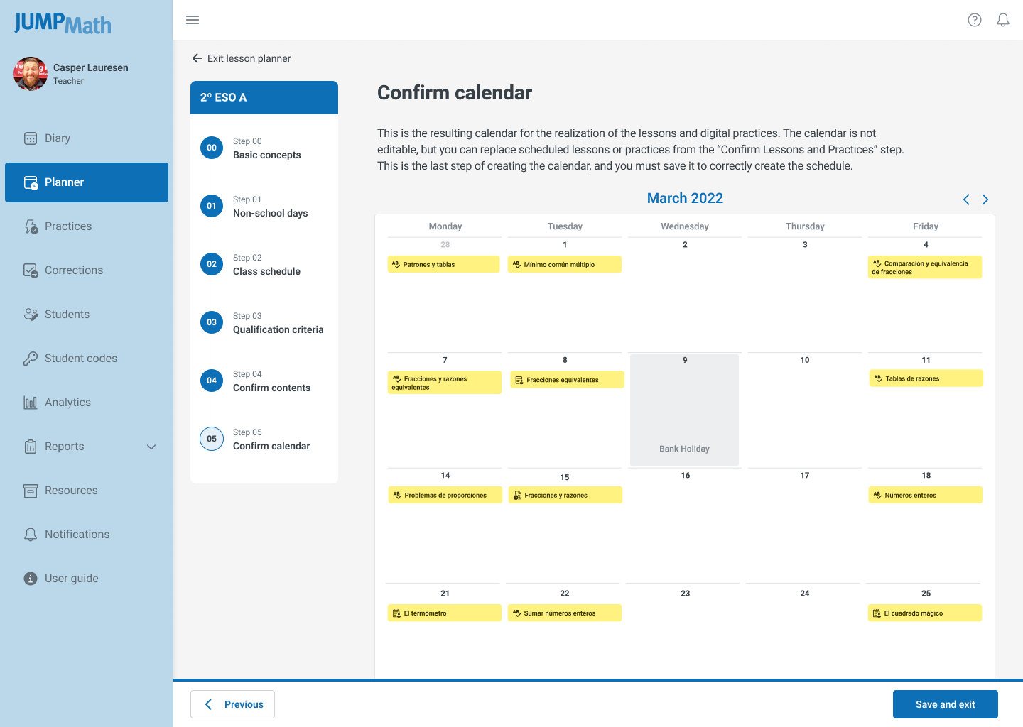
Real-Time Synchronization: The design ensured that changes in the "Settings" (time range) instantly reflected across the "List" and "Calendar" views without page reloads.

Phase 4: Final Product and Impact
The redesigned Lesson Planner was deployed with a focus on flexibility and accessibility.
Key Outcomes:
- Workflow Efficiency: Reduced the planning process from a rigid 6-step sequence to a fluid, single-view interaction.
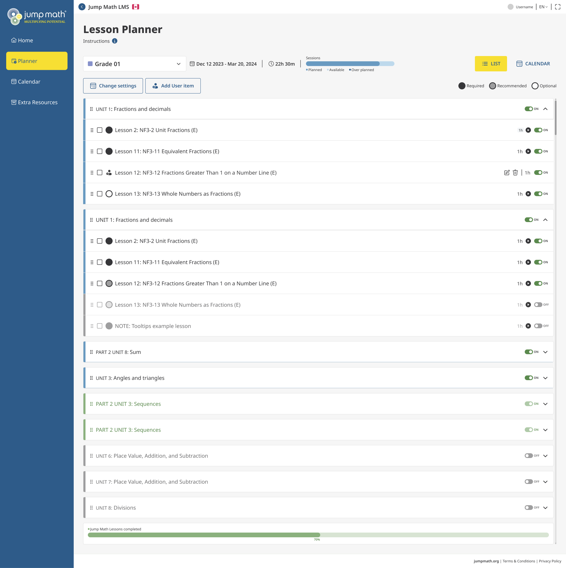
- Flexibility: Teachers can now schedule lessons for any timeframe (week to year) and modify them in real-time via drag-and-drop.
- Enhanced Visibility: Overdue sessions are now highlighted with distinct visual cues, improving lesson tracking.
- Accessibility: Typography and contrast upgrades ensure full readability on large classroom projectors and small mobile screens.
- Scalability: The updated Design System components allow for faster future development of new features.
Conclusions
The redesign transformed the Lesson Planner from a restrictive administrative burden into a flexible, responsive tool that mirrors the dynamic reality of a classroom. By prioritizing user control and accessibility, we empowered teachers to focus less on software mechanics and more on delivering effective mathematics education.